Streamlining Research Grant Applications
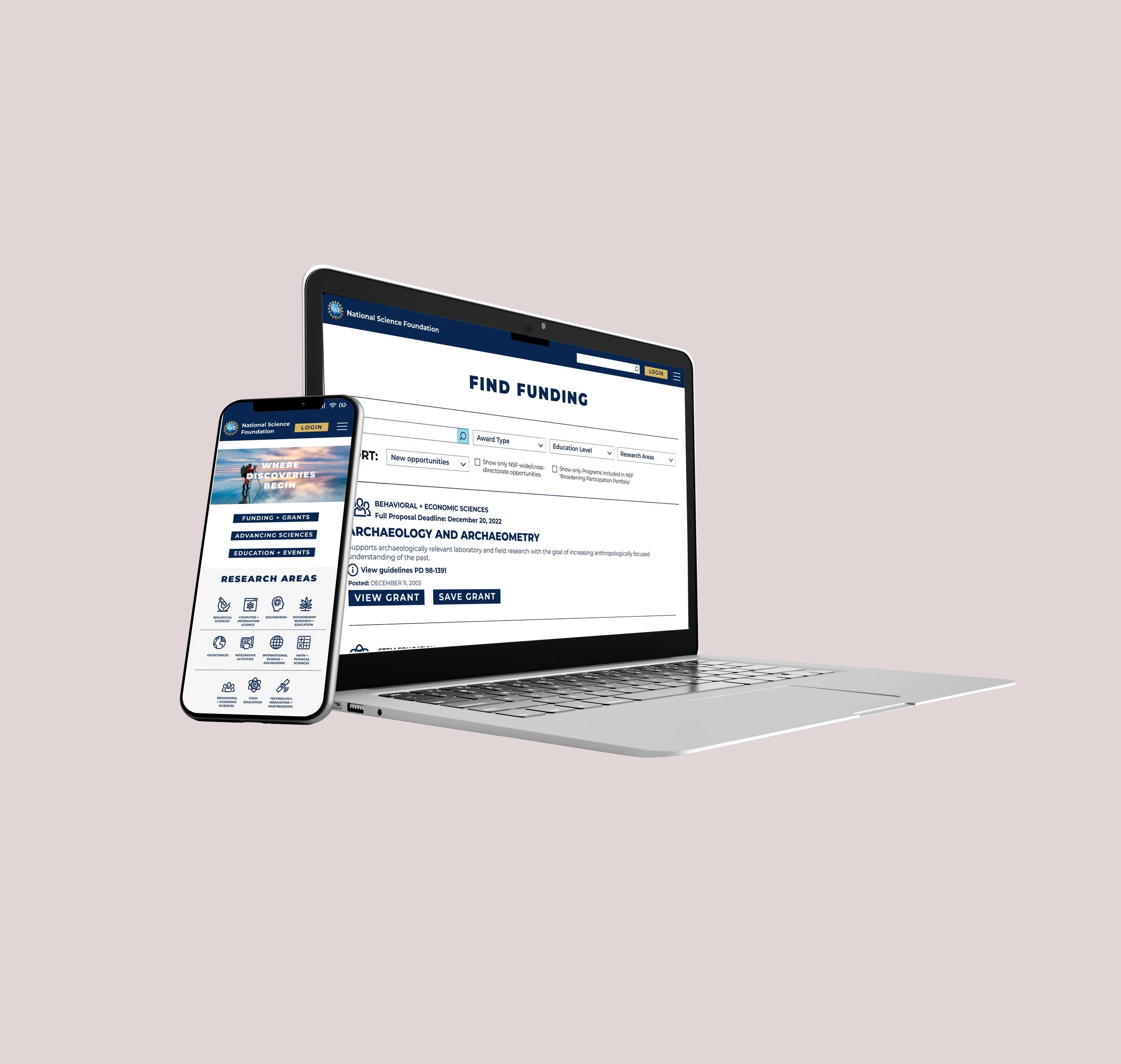
Final high fidelity prototype for mobile website
UX Process

Where Discoveries Begin…
The Problem:
The National Science Foundation (NSF) is experiencing record numbers of mobile traffic due to COVID-19, and they need an updated mobile website to encourage user satisfaction. Users need an efficient way to search and apply for grants without being redirected to multiple websites.
The Solution:
Deliver a mobile-first design with faceted navigation for intuitive grant search and integrate a seamless user profile feature that provides upload feedback.
Original NSF mobile landing page and information architecture


Research
-
We initiated research by conducting a comparative analysis between four additional organizations that issue grants to scientific institutions (Grants.gov, NIH.gov, AASCU.org, GrantForward.com).
The biggest takeaway was that all of these organizations had a login, where users would build and access their profile before applying for a grant, something that NSF.gov currently does not have.
-
We narrowed down the biggest opportunities to improve the original NSF website through a heuristic evaluation:
Recognition vs Recall - Top of homepage needs to present functions that are the highest priority for users
Flexibility and Ease of Use - Poor navigation for core actions
Aesthetic and Minimal Design - Incorrect image placement causes confusion and inconsistent text creates poor information hierarchy
-
After conducting a heuristic evaluation and determining the need for reorganization of information architecture, we conducted a hybrid card sort with 13 individuals to understand how people categorize grant information.
-
We conducted 5 interviews with industry professionals in order to adequately gauge user behaviors, one of which was an active NSF Postdoctoral Fellow.
Our objective:
To understand decision-making behaviors when interviewees are seeking funding, applying for grants, and to gauge their trust when applying for grants on a mobile website.
-
Affinity mapping helped me understand behaviors and trends in user interviews in order to identify key takeaways:
Users feel reluctant to search for grants through NSF on mobile, due to the overwhelming information displayed
Users would prefer to search on mobile and submit on desktop
Users need to feel safe when uploading important application documents
Users need to stay organized as they keep track of several components before submitting an application
-
After synthesizing the data collected from user interviews through affinity mapping and how-might-we statements, we consolidated key demographics, needs, and behaviors to create a persona named Constantine Abel.
Keeping Constantine’s needs and frustrations in mind was essential to developing a successful design solution for the NSF.

Design Solution
Based on detailed user research, our design solution included:
Integrating a user profile feature for Constantine to access her grant applications seamlessly on both mobile and desktop
Integrating faceted navigation for easy grant opportunity search
Updated information architecture to improve user navigation through the website
Most importantly:
We really wanted to empathize with the reluctance our users felt about applying for grants on mobile, so we designed a solution that is optimal for mobile, where our user flow includes access to the majority of the NSF website, but where the user will eventually be redirected to log in on desktop for grant submission.
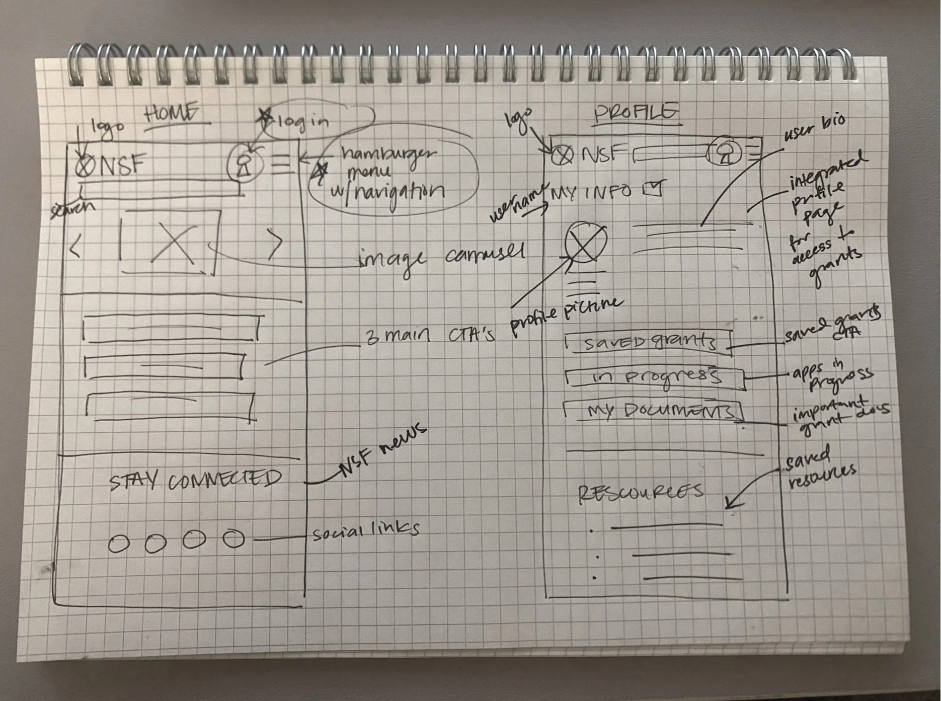
Initial sketch during ideation phase
Lo-Fi Wireframes
-
We transformed final ideation sketches into low-fidelity wireframes using Figma.
Key elements:
Login feature at the top right corner
Action buttons on the home page for most common tasks
Iconography to reduce cognitive overload
Faceted navigation
User profile
-
After finalizing all low-fidelity wireframes, we prototyped while keeping in mind a user task flow that takes you from the home page to the user profile in the process of finding and saving a grant.

Lo-Fi Wireframes with key features from design solution
Usability Tests
-
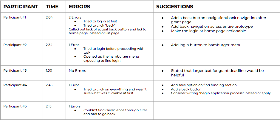
We conducted 5 usability tests and provided users with a scenario based on Constantine’s needs in order to address potential issues with our design solution or newly organized information architecture.
Task: Save a grant in Geosciences based on the Arctic to your profile and navigate to your profile to start the application for that saved grant.
Objective: User will be able to search, save, and start the process of applying for a grant within the experience of one website within 4 minutes and with less than 2 errors.
-
Results from usability tests indicated:
Missing actions/buttons on a few wireframes
Opportunities for more intuitive button placement
Login at start of prototype was attempted
-
Usability testing helped strengthen our final design iterations by:
Adding “back” navigation buttons across the entire prototype
Making login at the home page actionable
Emphasizing text and other CTA’s for more intuitive use
Branding
We took a look at NSF’s Brand Standards Manual and made sure to incorporate typography, colors, icons, and images that enhanced aesthetic design without reinventing the wheel:
A simplified color palate to reduce cognitive overload
Familiar fonts with varying weights to create a visual hierarchy
Icons to simplify information architecture

Our style guide for the National Science Foundation
Desktop Iteration
This iteration shows what Constantine’s user profile would look like on a desktop. This iteration aims to empathize with our users’ preference to search for grants on mobile but submit on desktop.

Final Hi-Fi Mobile Prototype
High fidelity mobile prototype takes you from the homepage to the user profile.